In 2026, your website is more than an online brochure. It’s often the first place customers decide whether to trust your business—and the main channel that turns interest into leads, calls, bookings, or purchases. That’s why every business needs a high-converting website, designed with website conversion optimization in mind from the start.
What “high-converting” really means
A high-converting website is built to guide visitors toward specific actions. Conversion doesn’t only mean sales—depending on your goals, conversions can include:
- Requesting a quote
- Booking a consultation
- Signing up for a newsletter
- Calling from mobile
- Downloading a resource
The key difference is intentional design. Instead of asking visitors to “figure it out,” a high-converting experience makes the next step clear, fast, and credible.
A great design isn’t the same as a great business outcome
Modern aesthetics matter—your site should look professional and be easy to navigate. But beauty alone doesn’t pay the bills. If your site has:
- Unclear messaging
- Too many choices or distractions
- Slow load times
- Weak calls to action
- Forms that are hard to complete
…then you may be attracting visitors without converting them.
In 2026, customers expect websites to do more than look good—they need to answer questions quickly and help them take action with confidence.
Why website conversion optimization matters more than ever
As competition increases and attention spans tighten, website conversion optimization becomes a practical business advantage. Conversion optimization is the ongoing process of improving your site based on real visitor behavior and clear goals.
That includes:
- Messaging alignment: matching what you say on the page to what visitors searched for or what led them there
- User experience (UX): reducing friction so visitors can move forward easily
- Performance: ensuring the site loads quickly across devices
- Trust building: using proof such as testimonials, case studies, certifications, and clear policies
- Conversion pathways: designing pages that naturally lead to your primary action
Mobile-first is now a baseline expectation
Most customers browse and compare services on mobile. If your site isn’t built for small screens, you’re likely losing conversions before they happen. A high-converting website is designed to:
- Keep content readable without zooming
- Make buttons and forms easy to tap
- Minimize pop-ups that interrupt the experience
- Ensure key information is visible quickly
This is part of solid business website design: the experience must be practical, not just polished.
Your homepage should earn the click (and the next step)
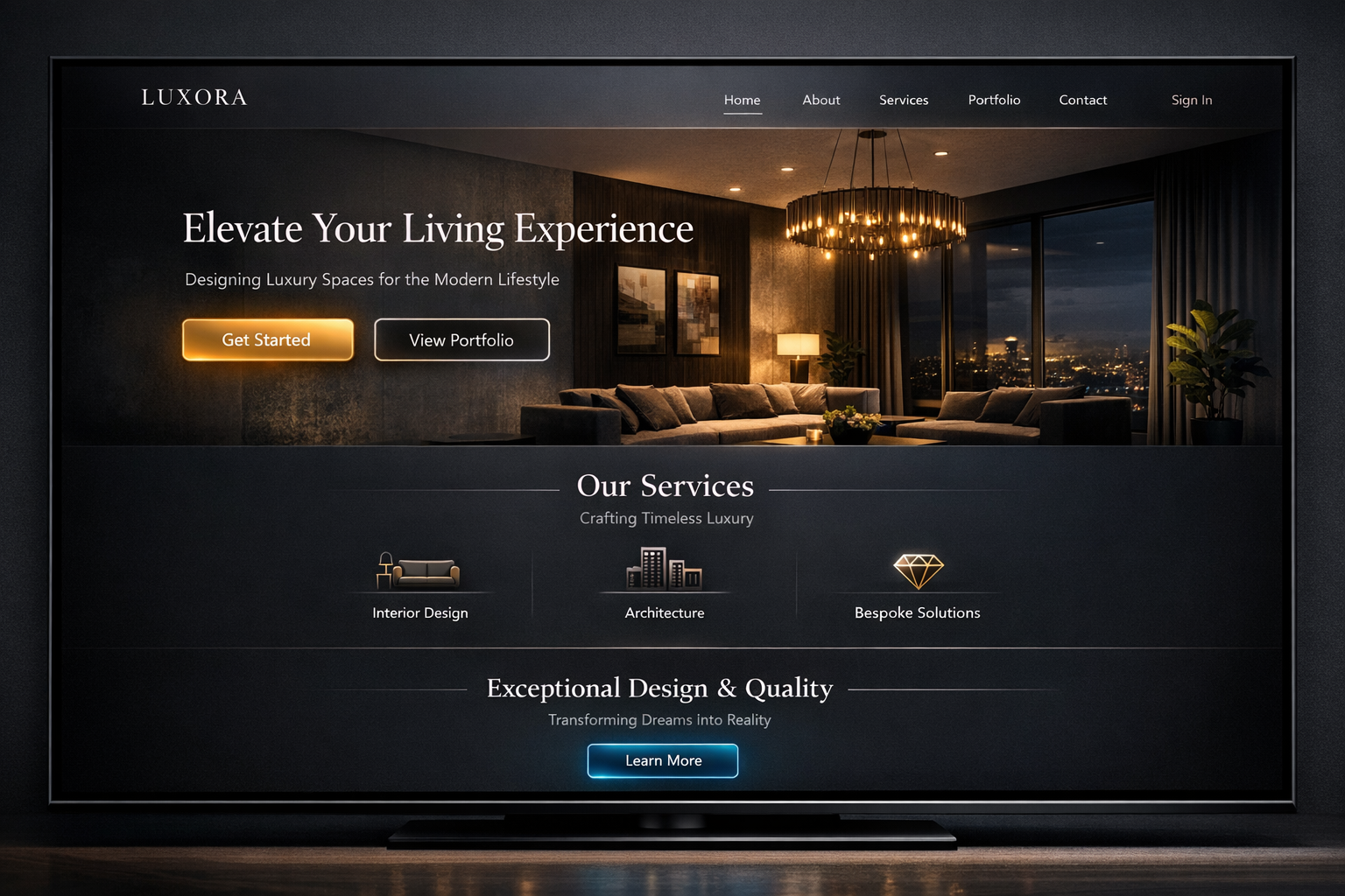
For most businesses, the homepage is where visitors decide if they should continue. A high-converting homepage typically includes:
- A clear value proposition (what you do and who it’s for)
- Simple proof that supports your claims
- Specific calls to action (one primary action plus optional secondary actions)
- Easy navigation to the pages that answer “how it works,” “pricing,” “services,” or “case studies”
If your homepage is vague, crowded, or difficult to scan, visitors may leave—even if your services are excellent.
Calls to action should match the visitor’s intent
Not every visitor is ready to book immediately. That’s why strong CTAs should reflect intent and stage of the buyer journey. For example:
- Early stage: “Get a free guide” or “Learn how it works”
- Comparison stage: “Request a quote” or “Schedule a consultation”
- Ready stage: “Call now” or “Book instantly”
A high-converting website makes it easy to choose the right next step—without forcing a hard sell too soon.
Trust signals convert when they’re specific
People buy from businesses they believe they can trust. But trust signals work best when they’re relevant and specific to the service you provide. Consider including:
- Customer testimonials tied to outcomes (not just generic praise)
- Case studies that show process and results
- Credentials, partnerships, or licenses (where applicable)
- Clear service areas, timelines, and what’s included
- Transparent policies (refunds, warranties, or guarantees)
These elements reduce uncertainty and help visitors commit with confidence.
Lead forms and checkout experiences should remove friction
If your forms are too long or confusing, conversions drop. Website conversion optimization often improves performance by simplifying the journey. Best practices include:
- Keeping forms as short as possible for your goal
- Using clear labels and helpful validation
- Showing what happens after submission (e.g., response time)
- Minimizing distractions around the form
Even small improvements can make a measurable difference in results—especially when applied across the site.
What “better” looks like: a website that guides, not just informs
A business website design that supports conversion typically features a consistent structure across key pages:
- Clarity first: What you offer, for whom, and why it matters
- Proof next: Evidence that you deliver on your promise
- Action always: A clear path to contact, booking, or purchase
When your site is built this way, you don’t just get traffic—you get qualified engagement.
How K10 Global helps businesses build conversion-focused websites
At K10 Global, we focus on creating high-converting website experiences that reflect your brand and support your growth goals. That means designing a site that’s easy to use, built to communicate value clearly, and structured to turn visitors into leads and customers.
Strong CTA: Get a conversion-focused website review
If you’re investing in marketing but your website isn’t producing enough leads or sales, it’s time to look beyond aesthetics. Book a website conversion optimization review with K10 Global to identify quick wins and prioritize the improvements most likely to increase results in 2026.
Let’s turn your website into a reliable growth engine—built for clarity, trust, and conversions.